
Design Principles: An Introduction
Instructor: Amity Femia
Course Description:![]() Design is the basis for all
other art courses and it includes the elements and principles of art. The material
will be presented through lectures and hands-on studio problems in two dimensions.
These will cover line, shape, texture, value, and color. Also the topics of
balance, unity repetition, and other principles will be introduced through
simple studio problems. This class will provide you with the tools to create
compositions in any medium.
Design is the basis for all
other art courses and it includes the elements and principles of art. The material
will be presented through lectures and hands-on studio problems in two dimensions.
These will cover line, shape, texture, value, and color. Also the topics of
balance, unity repetition, and other principles will be introduced through
simple studio problems. This class will provide you with the tools to create
compositions in any medium.
This eight-session class covered the basic principles of line, shape, value, color, and composition. Each project emphasized one principle, although successive projects drew on principles covered previously.
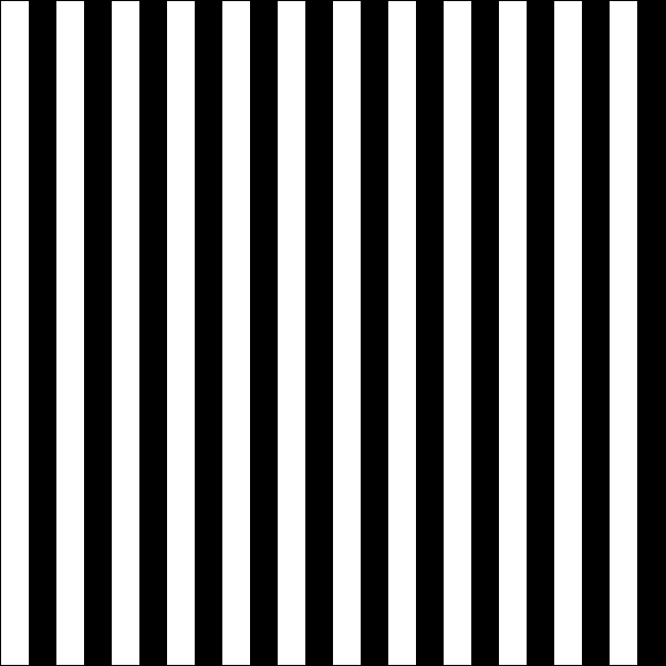
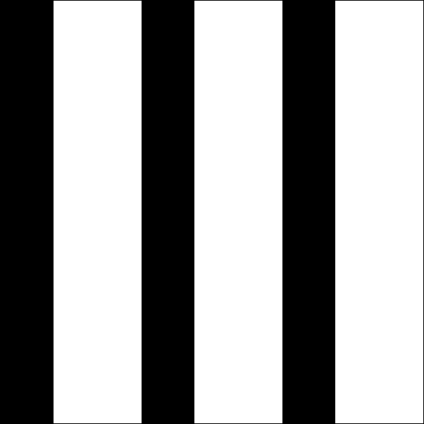
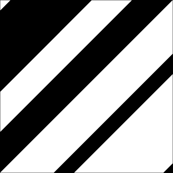
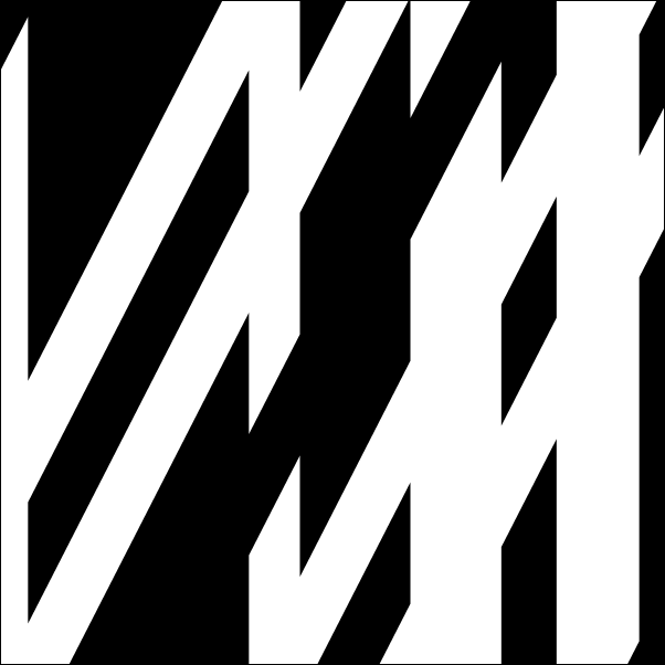
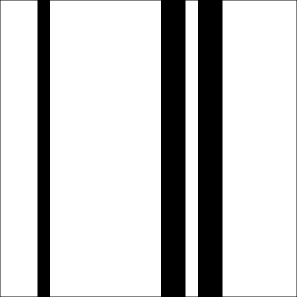
Project 1: Line
“Intent: To investigate how line can create the visual effects of balance, motion, and rhythm.
“Assignment: Using straight lines, develop six studies which clearly communicate each of the following principles: regular, alternating, and increasing rhythm; combination of two rhythms; and symmetric and asymmetric balance.”
I used Microsoft/Creature House Expression to produce these illustrations as well as the sketches for this project, but executed the studies themselves in cut paper.
| Regular Rhythm | Alternating Rhythm | |
|
|
|
| Increasing Rhythm | Combination of Two Rhythms | |
|
|
|
| Symmetrical Balance | Asymmetrical Balance | |
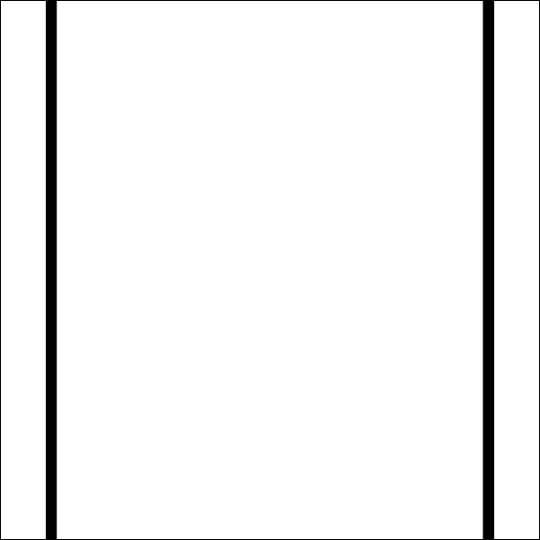
|
|
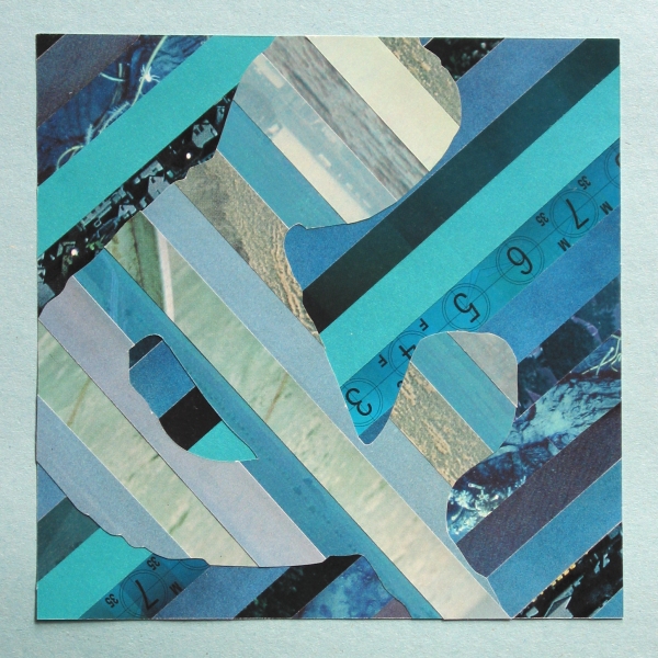
Project 2: Field of Vision/Composition/Shape
![]() “Intent:
To make visual choices that affect how
elements are composed on a plane. To train the eye to see at various scales. To
experience the play of negative and positive space.
“Intent:
To make visual choices that affect how
elements are composed on a plane. To train the eye to see at various scales. To
experience the play of negative and positive space.
“Assignment: A letter is not just a letter. It is also a shape, and contains an infinite number of shapes within it. Use a viewfinder to create nine ‘frames’ of various sizes over different parts of your shape. One frame must contain the entire letter.”

|
I executed the completed studies in a combination of cut paper and ink and mounted them on gray board. |
Project 3: Value
“Intent: To observe, differentiate, and organize a range of values.
“Assignment: Choose a newspaper to use as source material for a range of grey values. Starting with black on one end and white (unprinted) on the other, find solid values to complete a scale of seven units. These values can be found in parts of photographs, illustrations, or advertisements. Try to make the intervals between the values as even as possible. Some of your units may contain part of an image (not a completely continuous value). In this case, make an assessment of its average overall value (squint) and consider how it works with the rest of the scale. As an additional exercise, complete a scale in pencil.”
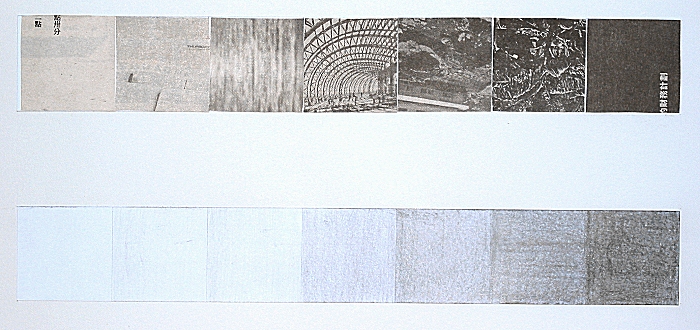
|
The completed value scales in newspaper cuttings and pencil. |
Project 4: Value, Shape, and Visual Depth
“Intent: To experiment with using value to create the illusion of 3-d depth. To practice creating dynamic compositions with repetition, shape, and 2-d space.
“Assignment: Chose a basic geometric shape as the ‘figure’ for your composition. Using an 11x11-inch square, create a composition using repeated drawings of your shape in pencil. Experiment with making your shapes recede or come forward in space using shifts in value, changes in scale, and/or illusions of overlapping or transparency.”

|
I used Microsoft/Creature House Expression to produce the illustration at left and the project rough drafts. I produced project in pencil. Interestingly, the project produces a decidedly different mood when viewed upside down. |
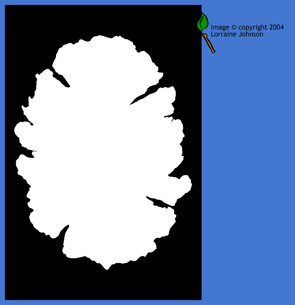
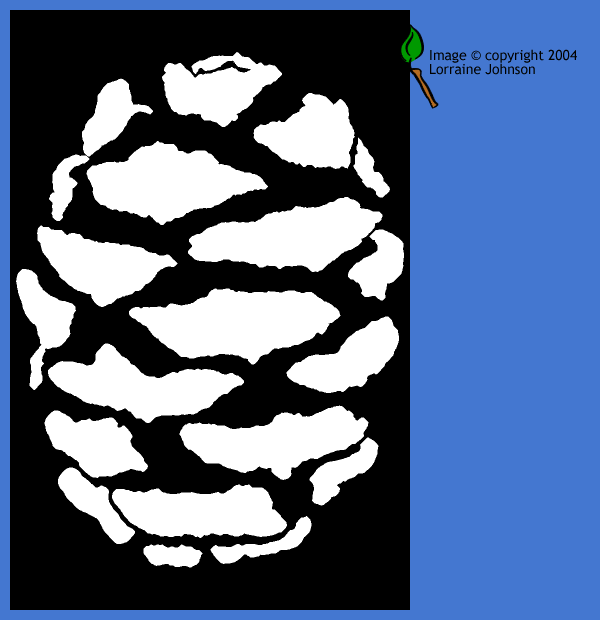
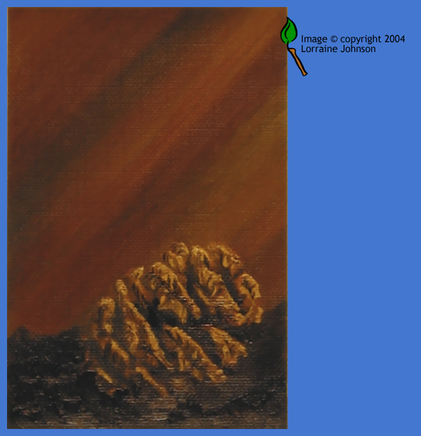
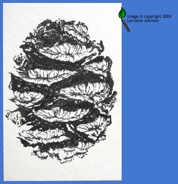
Project 5: Texture and Image
 “Intent: To experiment with multiples ways of
visually representing an object. To observe and incorporate the element
of texture into visual compositions.
“Intent: To experiment with multiples ways of
visually representing an object. To observe and incorporate the element
of texture into visual compositions.
“Assignment: Choose an object to be the basis for a study of image-making—an exploration of the range of expression, meaning, and techniques open to you as you respond to your object. Complete six studies of your object using any of the guidelines below, or finding your own approach. Experiment with a variety of media. Keep the format consistent throughout the project.
- Draw your object with the simplest possible outline of its form.
- Make a naturalistic study of your object, showing its values, volume, and texture.
- Draw the abstract volume and structure of your object (‘wire-frame’).
- Is there a pattern on the surface of your object: If so, draw a section of it.
- Draw your object as a graphic symbol, reduced to a simple black shape (or a white shape on a black background).
- Draw your object with the simplest possible gesture that still communicates what the object is.
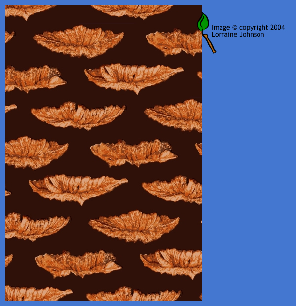
- Create a repeating visual pattern based on the shapes of your object.
- If you could be inside of your object, what would you experience? Draw it.
- Draw only the light and shadow of your object as seen in primarily one-source lighting: make the light solid white and the shadow solid black.
- Make a collage about your object using any kind of found materials.”
I used a combination of Jasc Paint Shop Pro and Microsoft/Creature House Expression to manipulate digital photos. Some studies I created electronically, others using natural media (oil paint, pencil, and felt pen).
| Outlines | Naturalistic Studies (Oil and Felt Pen) | |
|
|
|
| Repeating Visual Pattern | From the Inside (Pencil) | |
|

|
|
| One-source Lighting | Possible Logo Use | |
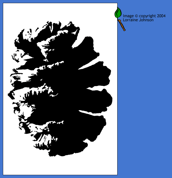
|
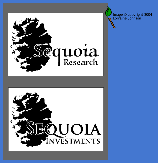
|
Project 6: Color Wheel
“Intent: To become familiar with a system of color theory as a way of organizing and thinking about color. To recognize and select the colors used in printed images
“Assignment: Draw a circle about 8 inches in diameter and divide it into 12 sections. Using magazine pages, cut 1- or 2-inch squares of color that correspond as closely as possible to the colors named on the color wheel.”
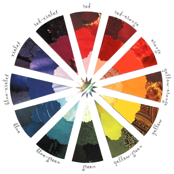
|
For an added challenge in constructing my color wheel, I included color tints (toward the center) and shades (toward the outside). |
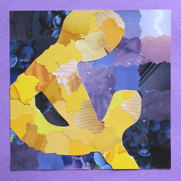
Project 7: Color Relationships
“Intent: To recognize how color relationships change the emotional and visual impact of a composition.
“Assignment: Create one small abstract composition of lines or shapes, using some of the principles we have discussed (e.g. variety in scale, line type, interaction with frame edges). Reproduce this design two times using a color medium (printed magazine pages, colored paper, paint, fabric, etc.). Each of your compositions should demonstrate one of the four color schemes below:
- Monochromatic (one hue plus white or black)
- Analogous (several hues next to each other on the color wheel)
- Complementary (two hues opposite each other on the color wheel)
- Triadic (three hues equally space on the color wheel)”
“Consider slight variations within the schemes, such as warm/cool, light/dark, intensity/dullness, and amount/proportion. Also notice how the scheme affects the symbolic or emotional impact of each composition.”
| I chose the ampersand from the Macintosh font Sand and produced the projects using cuttings from magazine pages. The monochromatic composition is in parallel strips (lines) of blue green, with different directions for the background and figure. The complementary composition is in modified squares of violet and yellow. The pieces of the receding violet background are arranged regularly, while the pieces of the advancing yellow figure are pieced to follow the outlines of the shape. | Monochromatic | Complementary | ||
|
|
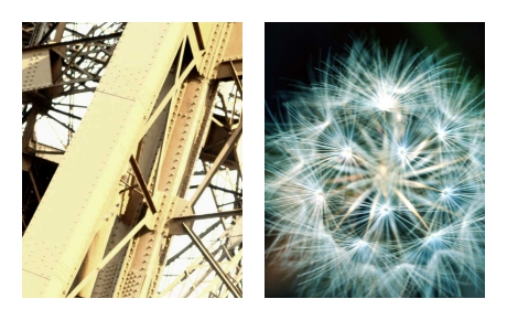
Long-Term Project: Visual Oppositions
“Intent: To explore the nature of composition, emphasizing the process of selection. To identify and communicate a focused visual idea.
“Assignment: Using the list of formal attributes below, create a series of photographic pairs that communicate each concept as clearly as possible (and example pair = one image that expresses ‘large,’ while the second expresses ‘small’). Crop and cut your images using magazine photographs, and be sure that the size and shape of your rectangle stays the same within each pair. If you wish, you may complete the assignment by taking your own photographs.
“Use images that are abstract and content-neutral; solve the problem with compositional choices, rather than subject matter. Avoid common, cliche approaches to both composition and subject. Paste each pair side-by-side on white paper or board.”
| Large/Small | Opaque/Transparent | |

|

|
|
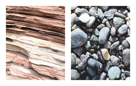
| Deep/Flat | Hard/Soft | |
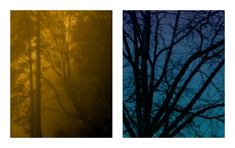
|
|
|
| Orderly/Chaotic | ||
|
Image credits:
Fingerprint
photograph is © 2004 Jonathan Day-Reiner, used with permission.
Saturn’s rings
image is from the Cassini-Huygens mission.
All other images are from a commercial clip art package.